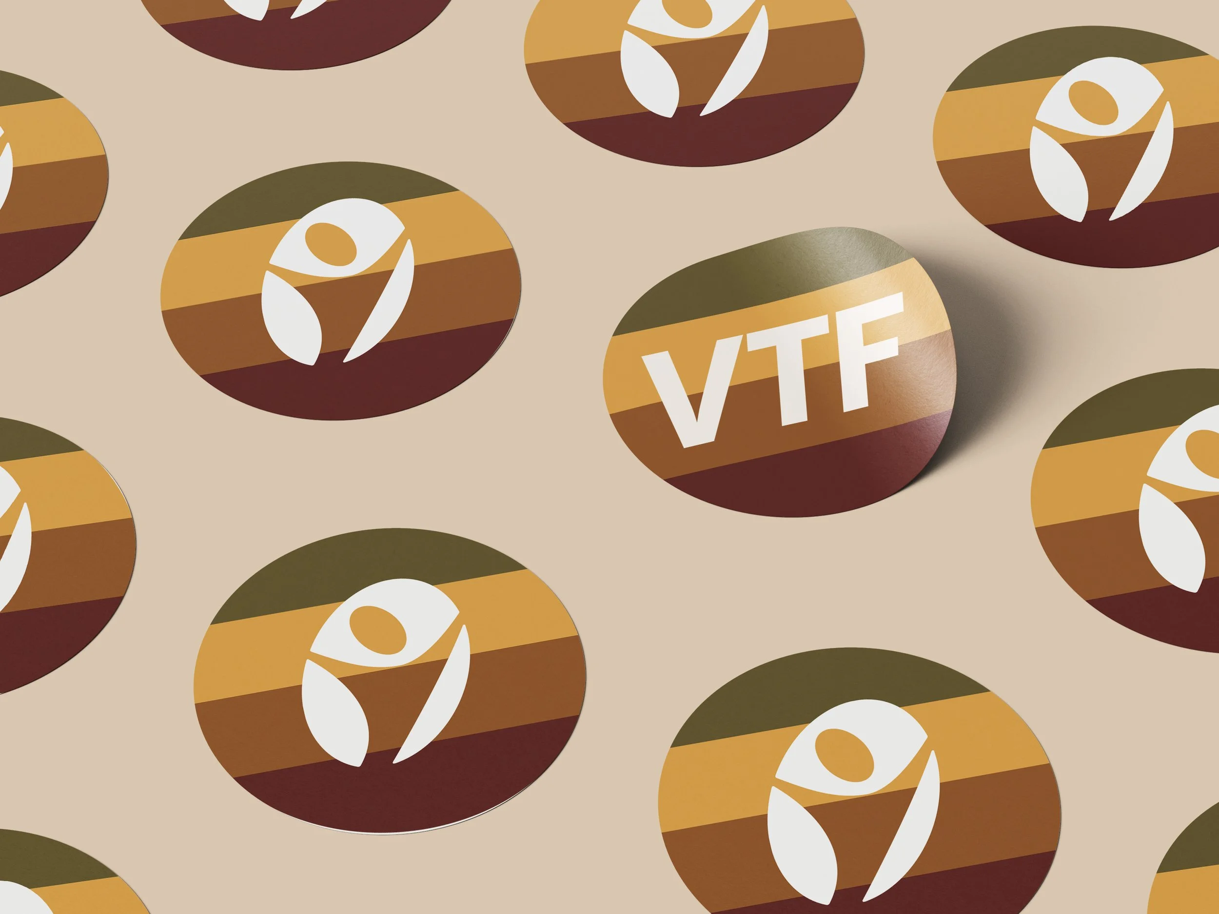
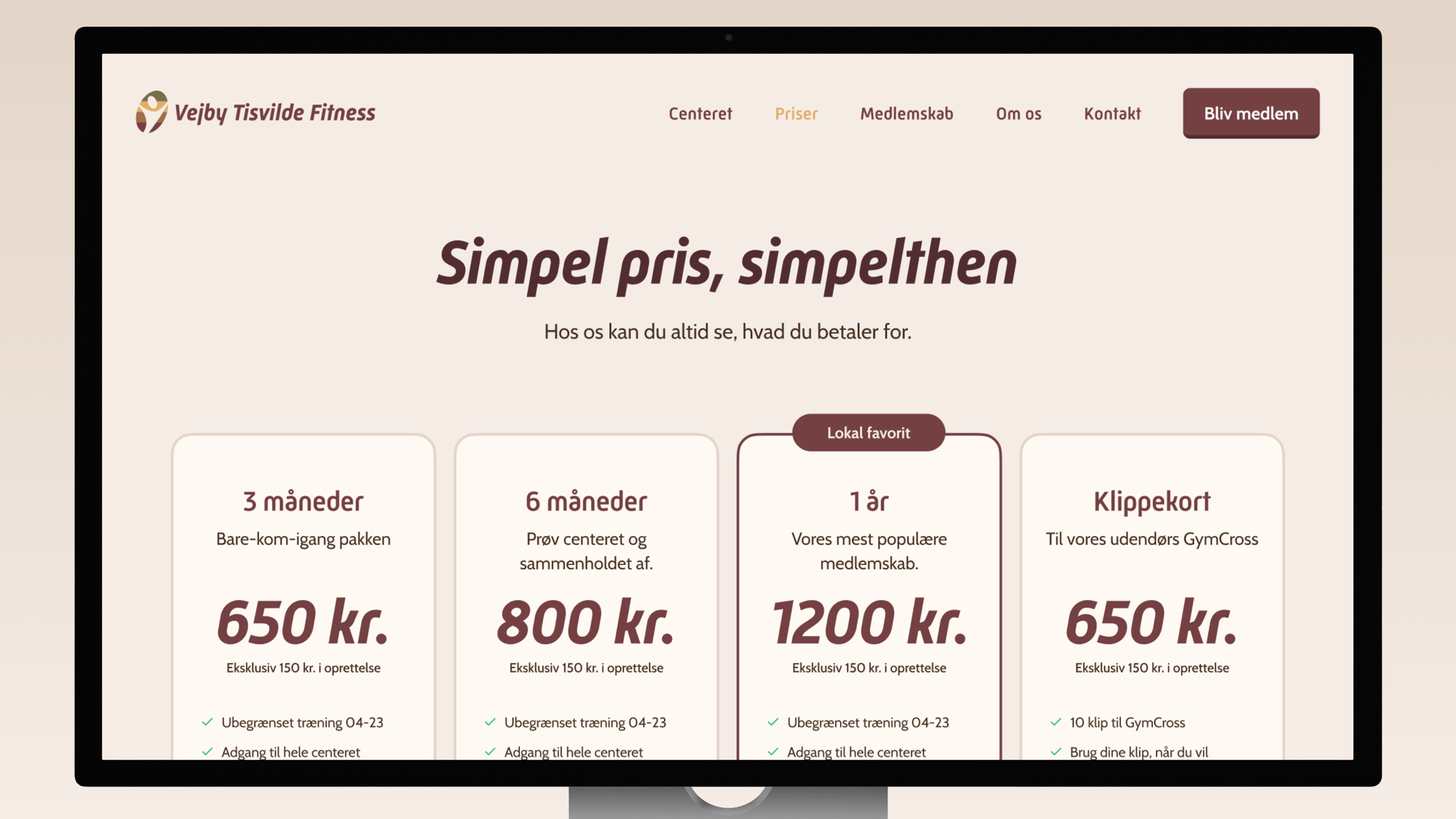
Vejby Tisvilde Fitness Logo and Identity
Employer
Redhill
Year
2026
Tasks
Logo, identity, website, merch and marketing materials.
Company
Vejby Tisvilde Fitness is an affordable centre, located in Vejby and open to people of all ages. Its youngest member is 15 years old and its oldest member is 91.
It is certified by DGI and DIF as part of the fitness centre union, the first of its kind in North Zealand. It operates as a division of both Vejby IF and Tisvildeleje GF.
Brief
The client wanted a refresh of the existing logo, with the goal of creating a contemporary and refined version.
“The logo should be simple and easy to recognise and clearly communicated fitness.”
“The identity should feel less »exclusive club« and more »local community gym«.”
Solution
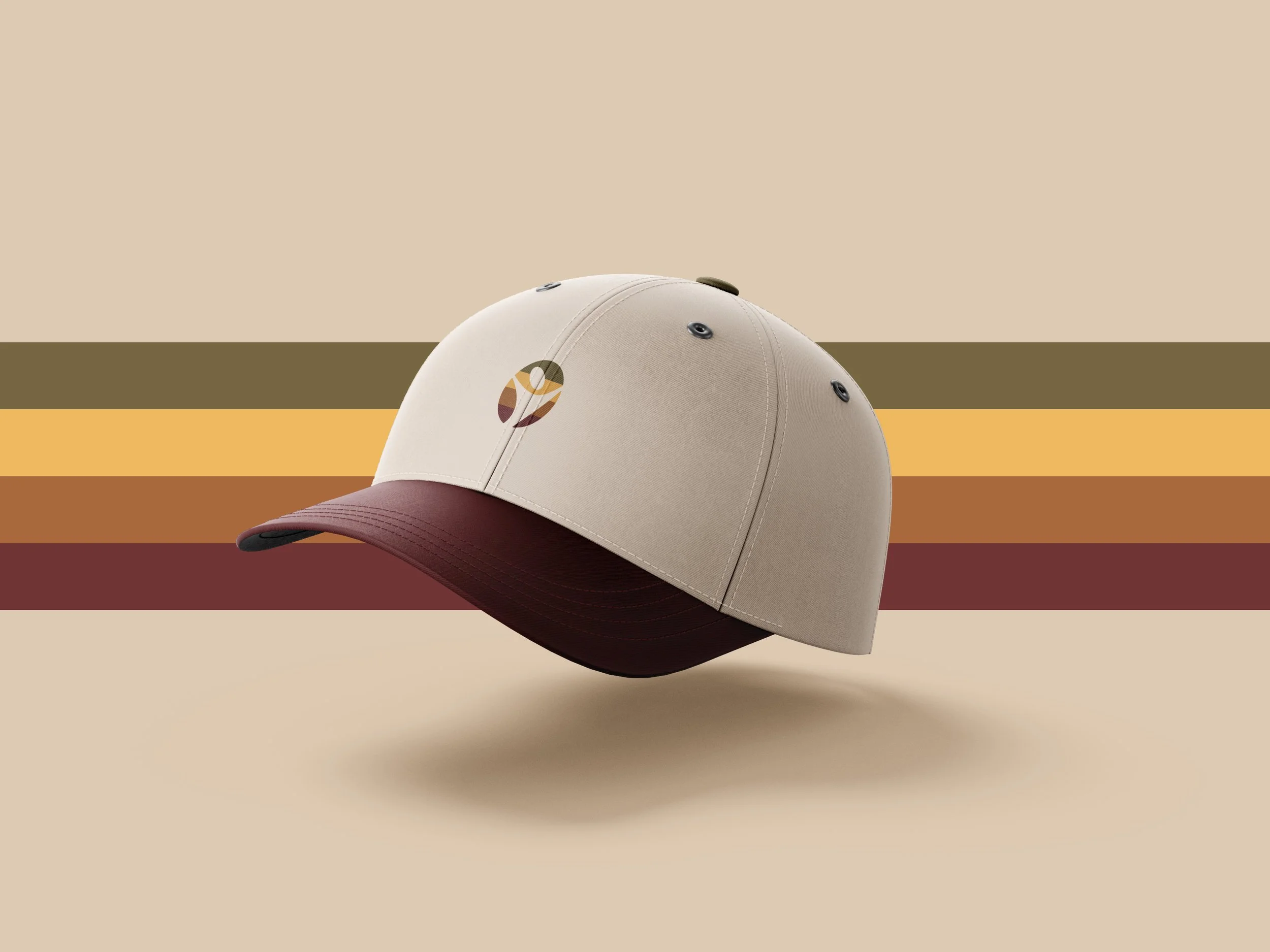
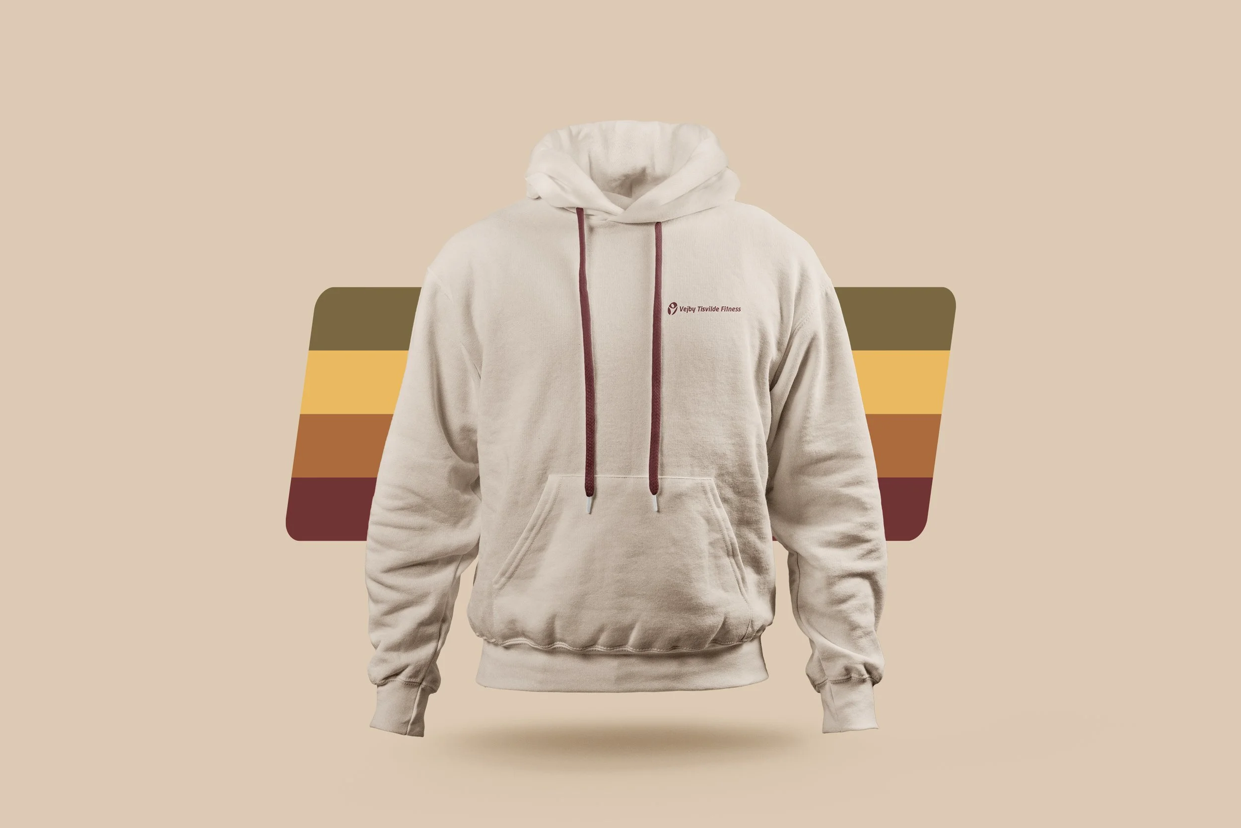
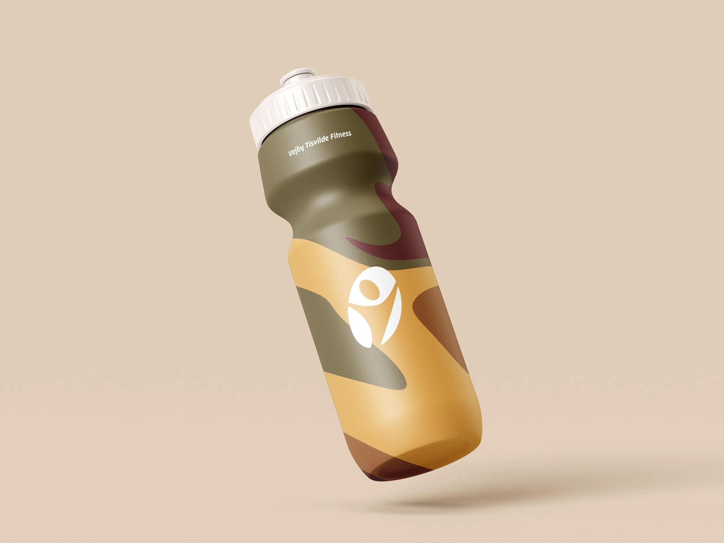
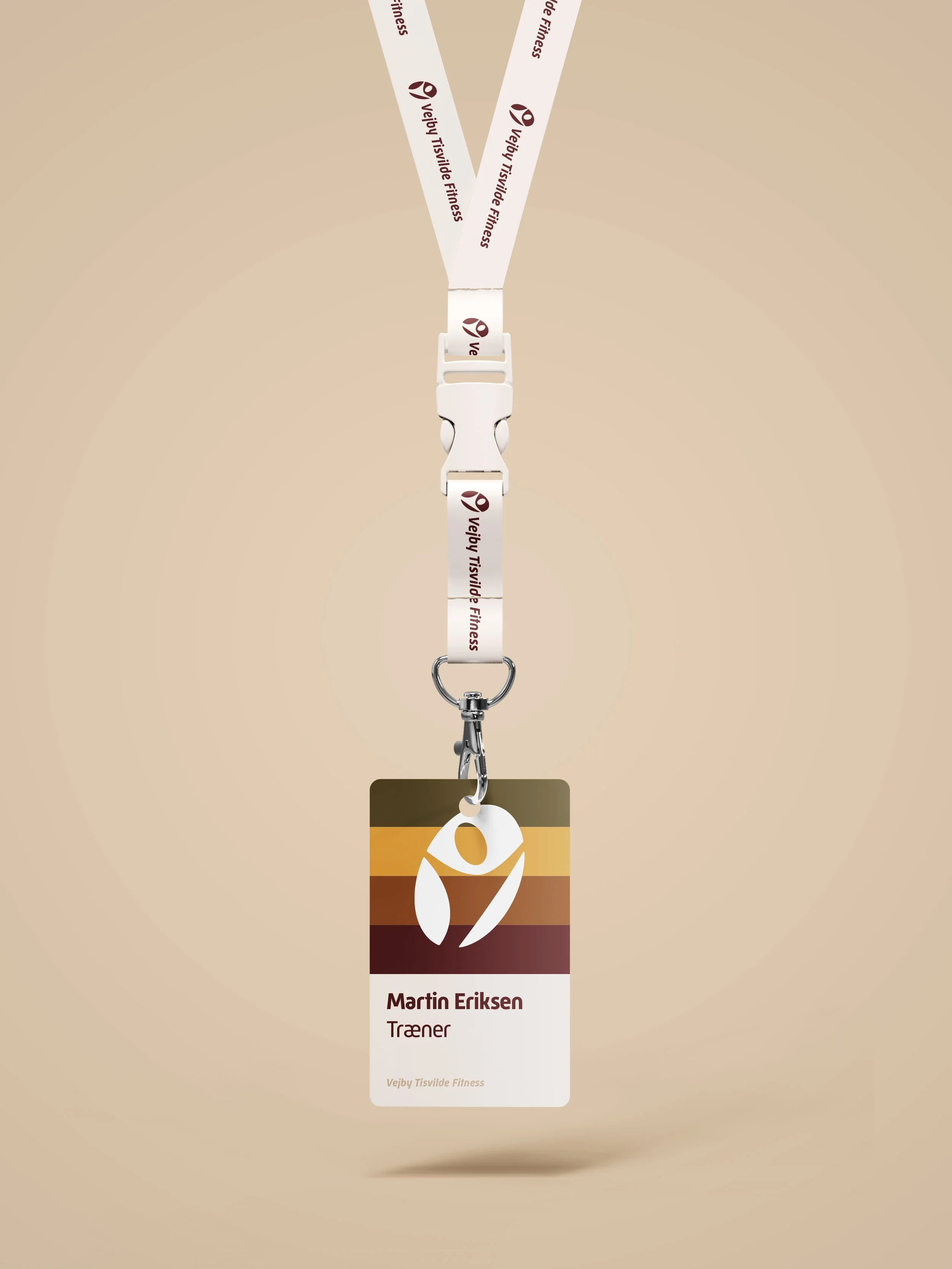
The goal is to refine the existing core elements and implement the new identity across the website, branded merchandise and marketing materials.
This update strengthens the connection to fitness, community, and the down-to-earth atmosphere.
Result
The new identity is more cohesive and distinctive than ever before. Leaning into the charming retro aesthetic of the old logo, it embraces a look that feels both contemporary yet familiar.
ProcessThe old logo
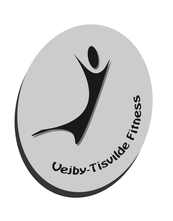
Preserving these brand elements
Human-centric focus
Brand name
Evolving these brand elements
Brand mark
Logotype
Color palette
Typography system
ProcessCreative Keywords
Brainstorms and mind maps helps define the overall mood, look, and feel. Below are the main key words that guided this project.
Approachable
Friendly
Warm
Hygge
Local
Fitness
ProcessColor exploration and inspiration