Sillebroen Logo and Identity
The Company
Sillebroen is a contemporary shopping centre located in the heart of Frederikssund, rooted in its local surroundings and everyday life by the fjord.
It houses approximately 60–75 stores, cafés, restaurants, a pharmacy, fitness facilities and a cinema. Residential apartments are located on the rooftop.
The shopping centre is named after the Sillebro Å, a river that flows past the shopping centre and ends in Roskilde Fjord.
The Problem
Sillebroen Shopping was facing several issues with its visual identity. The logo was outdated and struggled to perform well in the digital age. Their design files were in disarray or missing. They had no design manual to guide them. In short, an update was long overdue.
The Solution
The client requested a refresh – not a redesign. A redesign means scrapping the existing logo and creating something entirely new. That’s not what this project was about.
A refresh, on the other hand, means:
Keeping what is distinctive and most recognizable about the Sillebroen brand
Updating and refining those elements so they meet today’s standards and reflect where Sillebroen is today
In short: this is about evolution, not revolution.
The Result
Sillebroen has evolved successfully from a shopping centre into a cherished brand, securing its place in the hearts of locals.
Employer
Redhill
Year
2026
Tasks
Logo, identity, website, wayfinding and signage, banners, poster, flags, advertising, and more.
ProcessSillebroen’s Goals and Success Criteria
The Look and Feel
“A contemporary look rooted in the local area, reflecting Frederikssund and Sillebroen.”
“It should feel authentic, fresh, local, and inspiring. A clear style and tone.”
Ease of Use
“Sillebroen must be able to work independently with the identity and develop new material based on the design guide.”
“The design guide must be simple and easy to work with.”
Future Proof
“Sillebroen must be able to work independently with the identity and develop new material based on the design guide.”
“The design guide must be simple and easy to work with.”
The Old LogoProcessCreative Keywords
Brainstorms and mind maps helps define the overall mood, look, and feel. Below are the main key words that guided this project.
Authentic
Local
Fresh
Shopping
ProcessWorkshop Extract
In order to gain a better understanding of Sillebroen's vision, we held a workshop that focused on the style, tone, appearance and overall feel of the project.
Informal
Formal
Minimalist
Maximalist
Playful
Serious
Organic
Geometric
Abstract
Concrete
Analog
Digital
Retro
Modern
Classic
Progressive
Feminine
Masculine
Young
Mature
Loud
Quiet
Simple
Complex
Subtle
Obvious
Luxurious
Economical
result
Logomark
The Bridge Is Preserved
The bridge was deliberately retained as the central element. It remains the defining feature of the new logo and the key visual link to the previous identity, ensuring instant recognition and continuity for the brand.
The Letter S
The letter S is more than just a character. It symbolizes the water flowing beneath the bridge and the rising sun above the fjord, reflected on the surface. And perhaps it holds even more interpretations still to be discovered.
The Fusion
The combination of the bridge and the letter creates a visually striking and aesthetically refined logomark. It is iconic, works well on its own, is easy to read, memorable, and instantly recognizable.
The Style
The logo's rounded corners and organic shapes contribute to a soft and welcoming expression, making it feel less formal. The curves of the "S" are deliberately not perfect, but organic and imperfect – this creates more vibrancy and vitality in the logo. Simultaneously, the brand mark is characterised by its remarkably high legibility.
Fine-Tuned for Practical Use
The logo is developed and tested with a focus on key aspects to ensure an optimal aesthetic and practical result. These include bridge placement, line thickness, size, shape, curve, arc, spacing and negative space. The absence of narrow areas makes the logo highly scalable and practical to use.
resultFull logo
The Logotype
The logotype features a clean, contemporary typeface that complements the symbol. The typography is clear and highly legible, ensuring the name is easily recognisable and memorable.
The harmonious proportions and clean lines of the letterforms create a professional, inviting expression. The logotype works well with the symbol, as both share a strong visual balance and cohesive identity.
The Expression
The full logo, shown here in a vertical version, elegantly combines simplicity and recognisability. The design is modern and minimalist, making it timeless and easy to apply across different platforms and materials.
IdentityTypography, colors, and graphic elements are the central building blocks of the brand. They are key tools for creating a cohesive and recognizable visual expression.
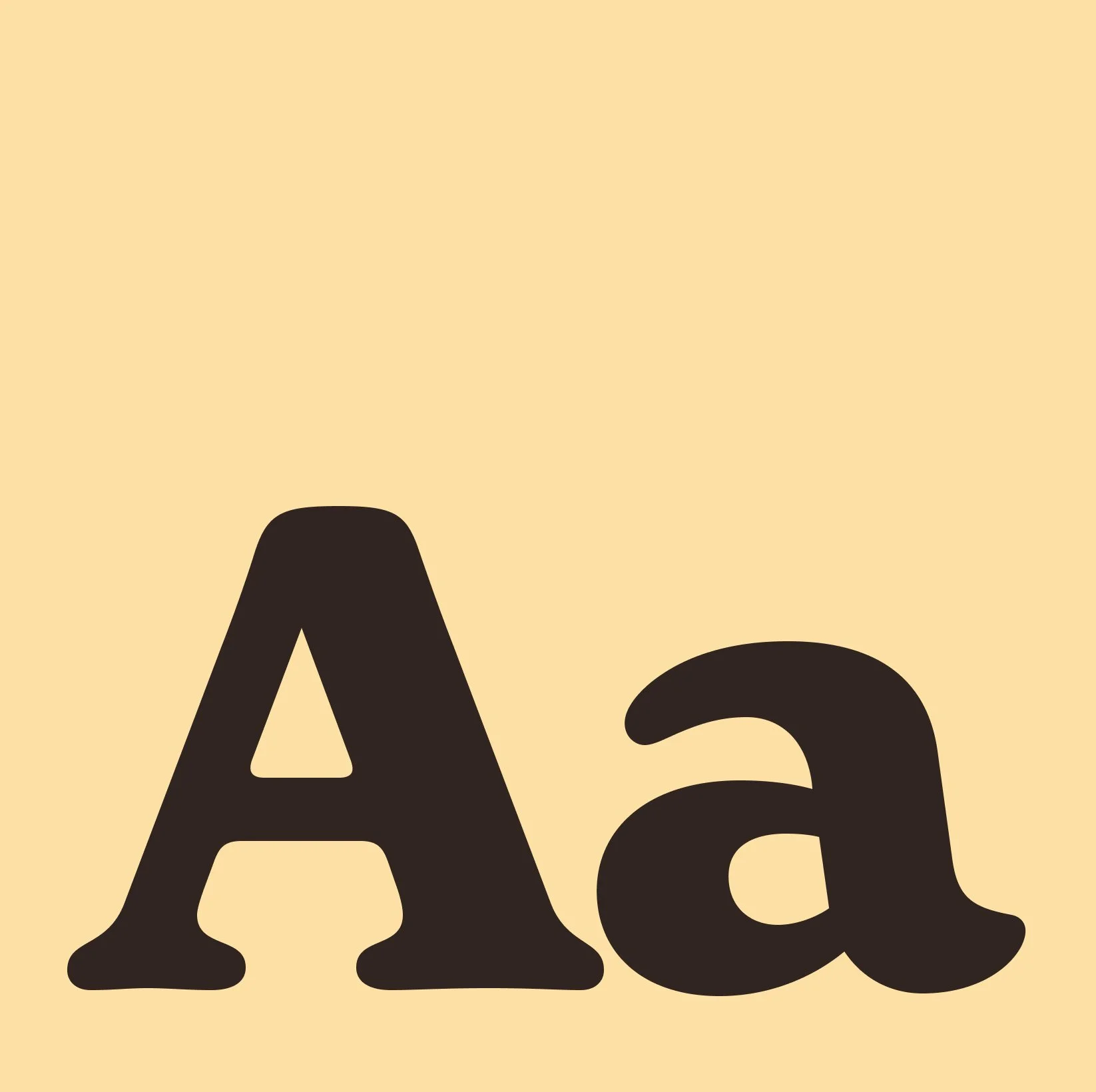
Identity fontNew Spirit
Used For: Headlines
New Spirit is a contemporary interpretation of classic serif typefaces, seamlessly blending tradition and innovation. It conveys elegance and professionalism while maintaining a fresh, modern aesthetic that makes it suitable for a wide range of applications.
With its refined details and balanced proportions, New Spirit manages to feel both timeless and contemporary, making it ideal for everything from print to digital interfaces.
Clear letterforms and carefully considered spacing ensure excellent readability, even in longer text passages. Subtle yet distinctive details in the letter shapes give the typeface a strong, recognizable identity that stands out without overpowering the content.
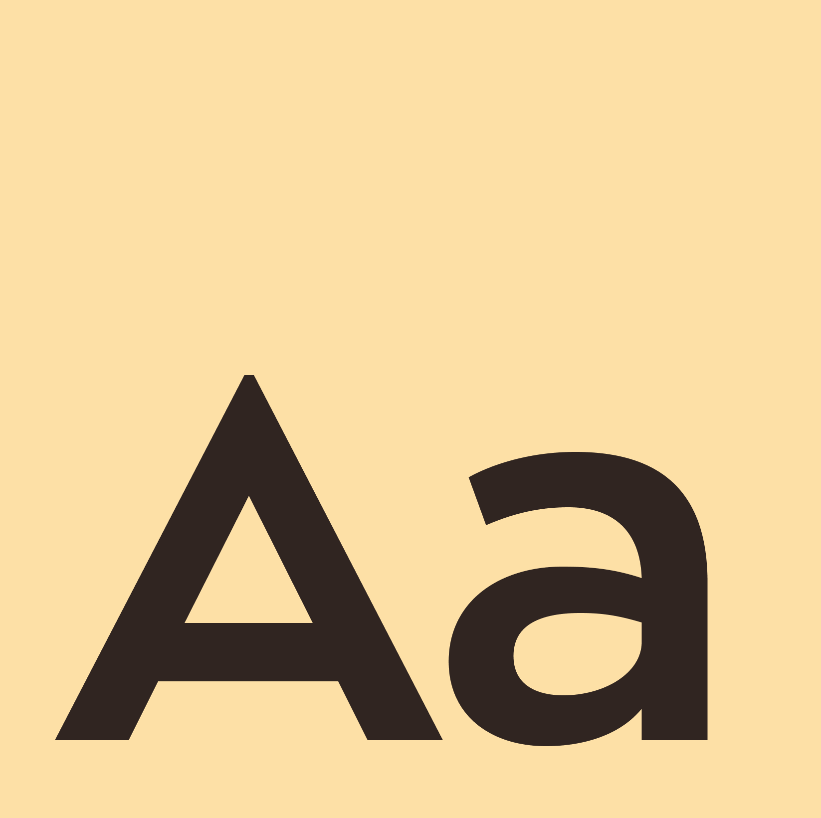
Identity fontGeometos
Used For: Text
Geometos Max is a geometric sans-serif typeface that combines simplicity with subtle elegance. Its clean lines and precise proportions are designed to create a modern, professional look that works across a wide range of applications.
Its greatest strength is its versatility. Geometos Max performs equally well in digital and print contexts and comes in multiple weights, making it easy to establish clear visual hierarchy and balance within a design.
Another key advantage is its readability. The clear, geometric letterforms ensure that text remains legible even at smaller sizes, making the typeface suitable for both screen and print.
Simultaneously, Geometos Max has a timeless character that adapts effortlessly to different styles and visual identities, making it a reliable choice for long‑term branding and editorial use.